According to the CDC Disability and Health Data System research, over 70 million adults in the United States – 1 in 4 – reported having a disability in 2022. According to Statista research, the United States has 310 million smartphone users and a penetration rate of over 96%.
Taking this a step further, a global estimate of 1.3 billion people experience significant disability - this represents 16% of the world’s population, or 1 in 6 of us. Europe mirrors this statistic with almost 20% of its population - that's 87 million people - living with a disability.
For mobile app developers, the primary takeaway from combining these data points is that building and testing accessible mobile apps is a must—not a nice-to-have. Even if your driving goal is “only” building a minimum viable product (MVP), a foundational level of accessibility is necessary to succeed in the market.
Of course, inclusive design is essential for reasons well beyond market success. But even developers and designers who care about accessibility tend to miss things. Disability, after all, is a big category that includes many different kinds of people with varying types of disabilities and accommodation needs, and capturing all of these concerns can be difficult.
As a result, accessibility needs to be a priority throughout the SDLC, with testing executed in tandem. Build your application as well as you can, but ensuring accessibility is only practical if you complement your inclusive design work with a mobile accessibility testing process.
What Is Mobile App Accessibility Testing?
Mobile app accessibility testing entails testing a mobile app, as opposed to a website or desktop application, for accessibility. This requires special consideration because the mobile devices these apps run on can make formerly accessible designs inaccessible.
An accessible webpage can become inaccessible, for example, if the mobile app version requires users to move their thumbs an uncomfortable distance. Developers can miss details like this if they focus on desktop users using mice instead of thumbs.
Many accessibility concerns overlap, however—such as integration with screen readers—so the key for mobile developers is building mobile app accessibility testing processes that take advantage of those overlapping points while ensuring mobile-specific issues are addressed, too.
Why Is Mobile Accessibility Important?
Mobile accessibility is essential for various reasons, and when these reasons are explained, stakeholders across the business should be on board with making accessibility a priority.
Market: Given statistics like the ones we cited above, many people are disabled, and as a consequence, if you want your mobile app to reach the masses, then some level of accessibility is necessary.
Curb-cut effect: The curb-cut effect gets its name from the impact of cutting curbs to make them accessible to wheelchair users. An action made on behalf of a disabled population can benefit abled people, too (e.g., parents with strollers). The same effect applies to mobile accessibility (e.g., making fonts more readable helps people with color blindness and people working in low-light environments).
Legal: The Americans with Disabilities Act (ADA) requires that businesses make their mobile apps accessible. The ADA doesn’t yet have specific technical standards, but previous court cases have established the Web Content Accessibility Guidelines (WCAG) as a reliable benchmark.
Ethical: Companies and the developers working for them want their apps to be used, and accessibility ensures people can actually use your apps. If you care about the benefits of what you’re building, it’s a simple ethical obligation to include everyone in using it.
Accessibility requires buy-in from the team and organization. In an article on failing (and then succeeding at accessibility), Trish Ang, senior software engineer at Slack, shares how a teammate found an accessibility issue after Ang launched her first big feature for Slack.
Ang was embarrassed but reflected on how much she appreciated the feedback, writing, “If your website is inaccessible, that means that real humans on the internet cannot use it. And for Slack, where we have over 10 million users daily, being unable to communicate with your teammates, interact with content, or being blocked from doing your work is simply unacceptable.”
Even if the number of users differs for your app, the same principle applies: Inaccessibility is unacceptable.
Complying with the ADA, WCAG, and the EAA
The ADA, WCAG, and EAA standards are intertwined, but your business context can introduce different legal requirements with varying levels of strictness.
ADA
The ADA requires that businesses make mobile apps accessible to people with disabilities, but without clear technical standards, compliance can be fuzzy. Generally speaking, however, legal precedent has established WCAG compliance as a solid guideline for most companies.
That said, the ADA comes into stricter enforcement with a variety of conditions, including whether:
The mobile app is linked to a physical location.
Customers can only access the business online.
The mobile app is used by federal employees.
In the last case, especially, WCAG compliance becomes a requirement instead of a guideline. The ADA provides numerous examples of compliance in this case.
WCAG
WCAG—now in version 2.2 as of November 2023—is the go-to set of standards for web and mobile accessibility. However, in a mobile context, different standards will be more or less relevant, and others will be more or less important.
EAA
The European Accessibility Act (EAA) is a directive from the European Union that mandates certain products and services be accessible for individuals with disabilities and functional limitations. Its goal is to enhance the internal market by eliminating barriers caused by varying accessibility regulations throughout the EU.
To comply with the EAA, organizations must make their websites and mobile apps accessible by following WCAG principles.
[Check out this guide to learn ways to prepare for EAA 2025.]
At the foundation, however, is a set of four principles that apply equally to all web content:
Principle 1: Perceivable. All components must be presented to users in a way they can perceive.
Principle 2: Operable. All user interface components and navigation elements must be operable and usable.
Principle 3: Readable. All text components and contents should be readable and understandable.
Principle 4: Compatible. Compatibility with all user agents, including assistive technologies, must be maximized.
In mobile contexts, different standards from these principles will have different weights. For example, the WCAG 2.4.11 Focus Not Obscured standard requires that other components not be entirely hidden when a user interface component gets keyboard focus. However, as W3C points out, numerous input focus types are needed in a mobile context—not just a keyboard.
Mobile App Accessibility Checklist
Ensuring comprehensive accessibility is all about the details, so a checklist is essential—especially if supported by an automated accessibility tool—to ensure you’ve covered all accessibility considerations.
Design and display
Ensure navigation is consistent across the app.
Maintain a color contrast ratio of at least 4.5:1 between text and background.
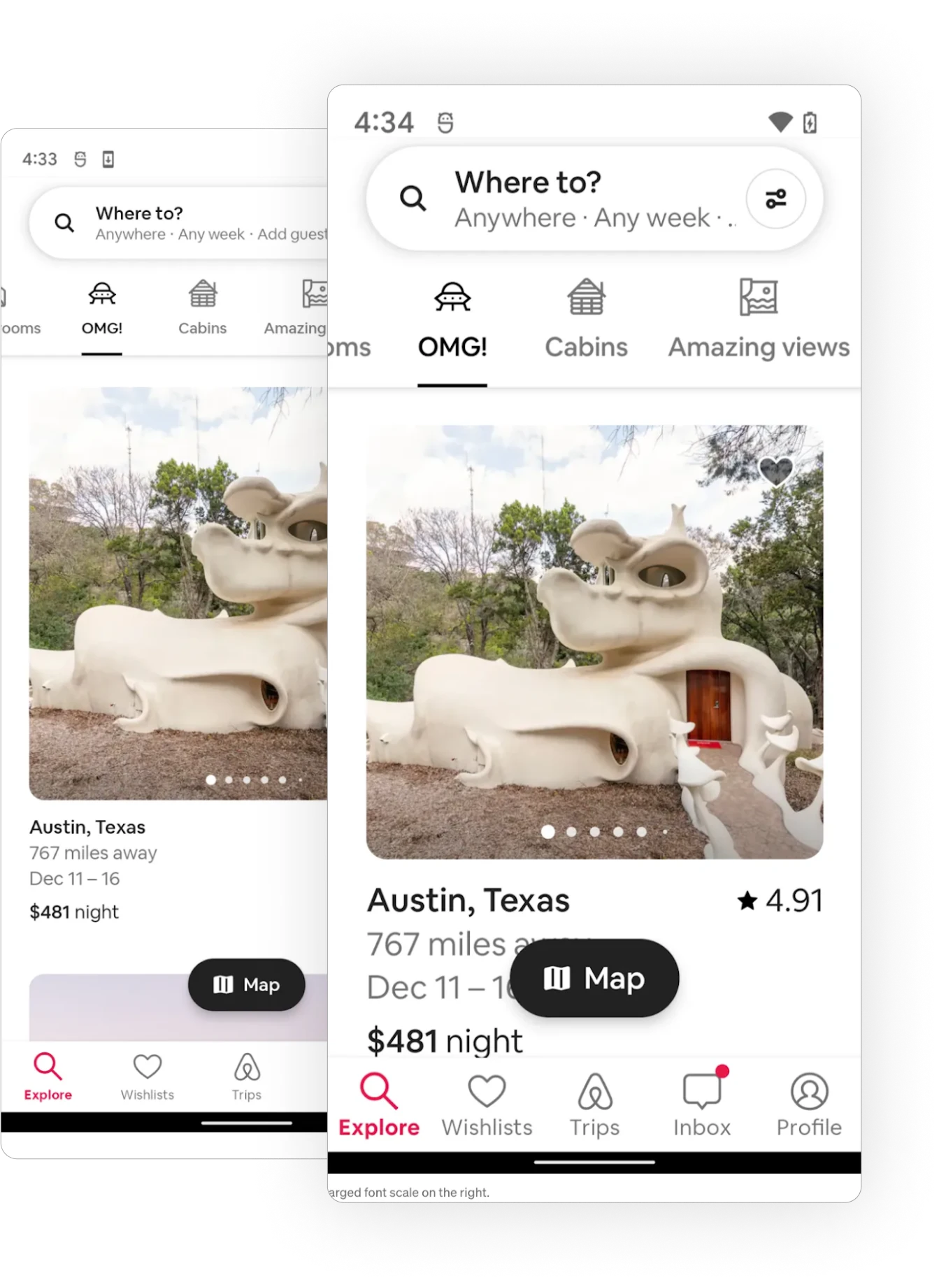
Allow users to adjust text size without breaking the layout.
Limit flashes to three per second.
Maintain at least 22×22 pixels of inactive space.
The example below shows how Airbnb ensures users can enlarge text size without breaking functionality.
Touch Targets
Ensure touch targets (e.g., buttons and links) are at least 44x44 pixels.
Ensure touch targets are spaced far enough apart to prevent mis-taps.
Provide visual and tactile feedback for touch interactions (e.g., button animations).
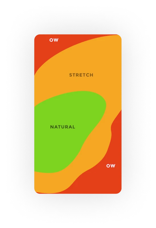
The image below, for example, illustrates the “thumb accessibility matrix,” a way of visualizing how hard it is to reach different screen elements with your thumb while using a mobile device.
(Source)
Screen Reader Compatibility
Use proper semantic markup elements (e.g., headings) to convey structure.
Provide descriptive labels for all interactive elements, images, and icons.
Utilize ARIA landmarks for better navigation with screen readers.
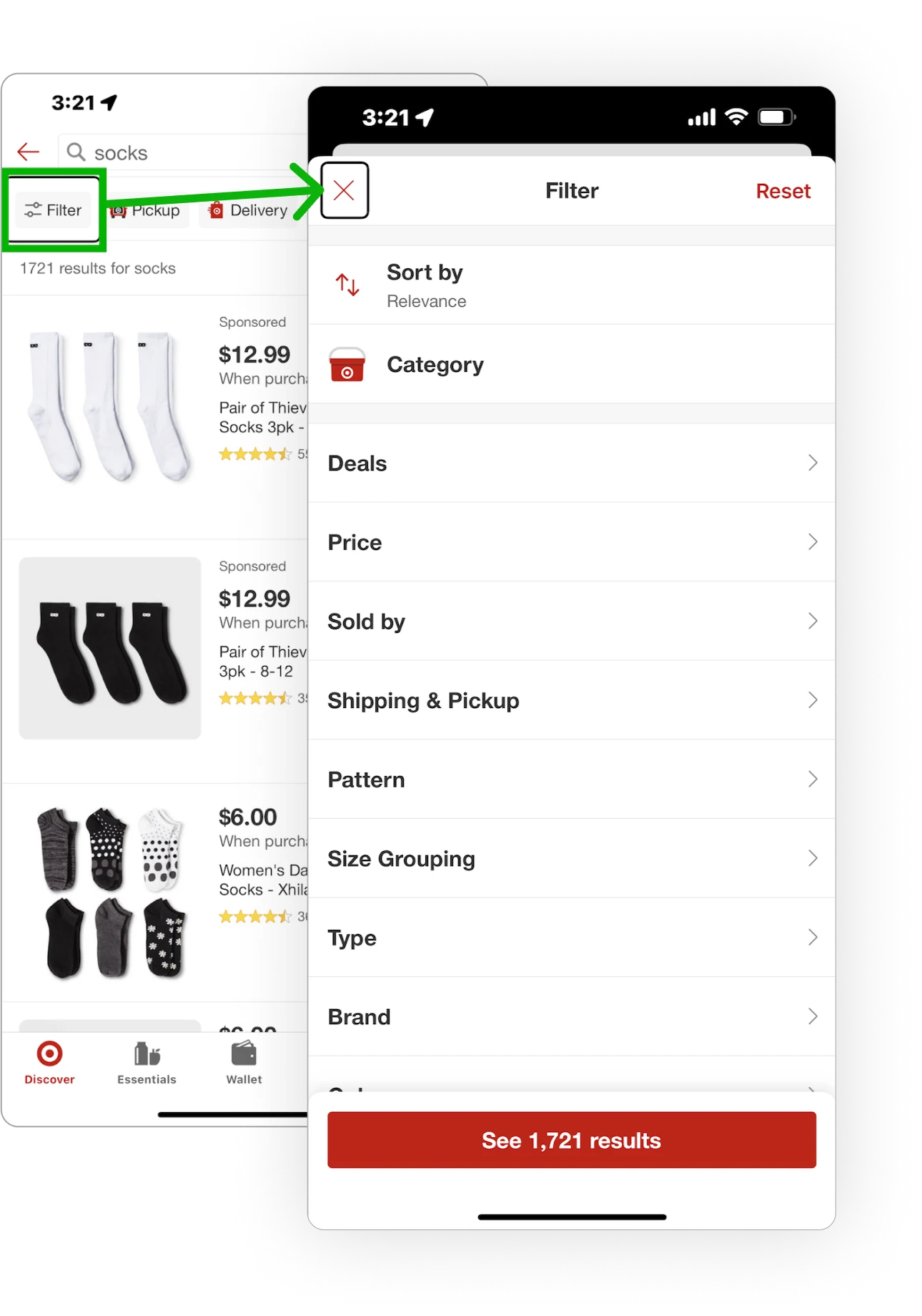
Nielsen Norman Group cites the Target mobile app as an excellent example of working with screen readers because, in the example below, the filter overlay takes the screen reader from the overlaid screen to the top of the overlay.
(Source)
Visual Elements
Include alt text descriptions for all images.
Avoid communicating important information through images alone.
Ensure text is readable over images or video backgrounds.
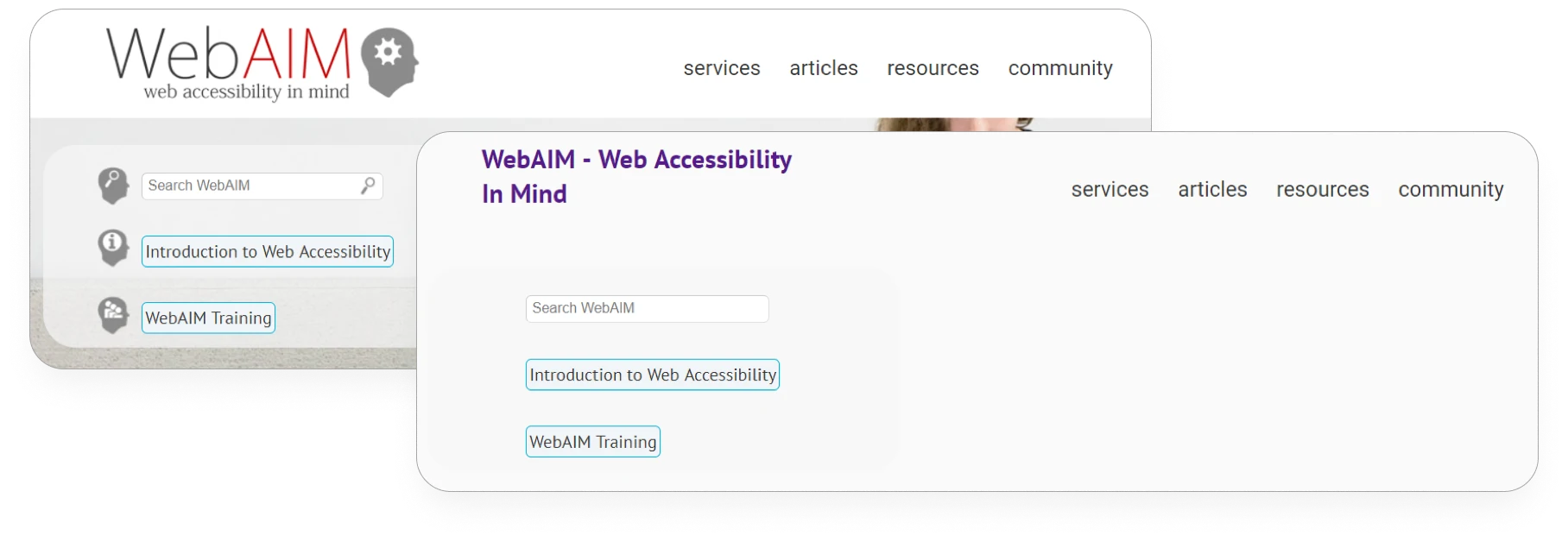
Deque provides a before and after example, showing one screen with images and one without so that you can see the alt text.
[Create actionable accessibility insights with Sauce Labs Real Device Cloud and Deque Axe DevTools. Learn more.]
Forms and Input Fields
Clearly label all form fields with descriptive text.
Provide clear instructions for error identification and ensure error messages are as accessible as the rest of the app.
Ensure all form elements can be accessed using a keyboard.
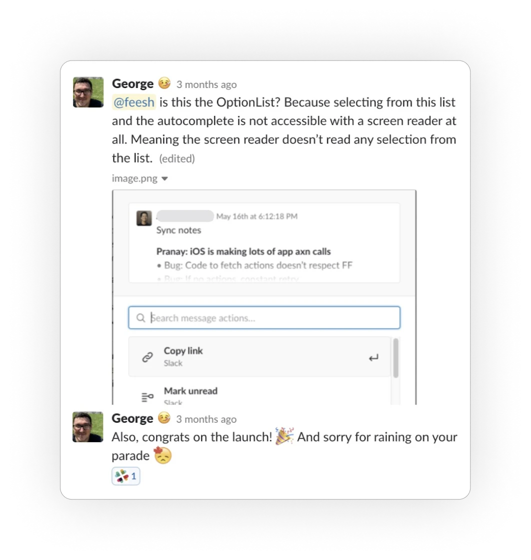
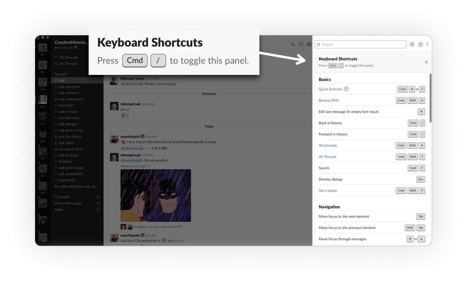
In the example below, Slack provides a keyboard shortcut panel that can be accessed via the keyboard.
(Source)
[Get ready your organization ready for the European Accessibility Act. Tune into our conversation with Deque]
Multimedia Content
Provide captions and transcripts for videos, including live audio/video content.
Include audio descriptions for important visual content in videos.
Offer a way to skip repetitive content in multimedia presentations.
Airbnb, for example, uses the View.setAccessibilityPaneTitle() and View.announceForAccessibility() APIs to announce descriptive page names to users.
(Source)
Test for accessibility
Use automated testing tools to identify accessibility issues proactively.
Involve users with disabilities in user testing to get direct feedback on accessibility.
Test the app on different devices and platforms for consistent accessibility.
For example, automated testing tools like Sauce Labs allow you to include accessibility tests among the rest of your tests.
Manual vs. Automated Accessibility Testing
Both manual and automated testing methods are necessary for ensuring mobile accessibility.
Manual accessibility testing involves using the apps in question (often with help from a focus group of disabled users) to ensure the apps work across different devices and accessibility tools. Automated accessibility testing involves using a tool that can automatically run various accessibility checks at once.
Automated testing is often necessary for modern mobile apps to ensure they keep up with the variety of accessibility demands in play—especially as developers iterate the app over time. With cross-browser testing tools and emulators, in particular, developers can check how the software works across different browsers and OSes without loading each browser and OS.
Mobile App Accessibility Testing Tools
There is a wide range of mobile app accessibility testing tools, and developers must use numerous ones to meet all accessibility demands.
iOS
Xcode Accessibility Inspector - Built into Xcode, Apple’s development environment for macOS and iOS, Xcode Accessibility Inspector helps developers test for accessibility, including the attributes of UI elements and the hierarchy of an app’s user interface.
VoiceOver - Built into iOS devices, VoiceOver is a screen reader feature developers can use to test screen reader functionality, gesture-based navigation, and speech customization.
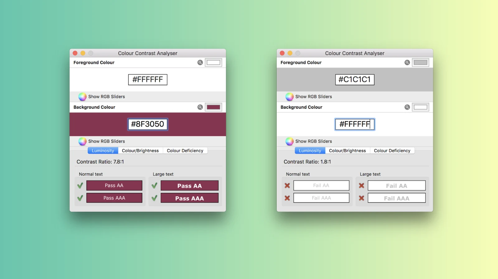
Color Contrast Analyzer. Developers can use Color Contrast Analyzer via macOS to check the color contrasts in their iOS app designs and ensure the design and the contents are understandable. In the image below, you can see examples of color contrasts succeeding and failing.
(Source)
Android
Android Accessibility Scanner. Developed by Google, the Android Accessibility Scanner helps developers evaluate the accessibility of Android apps by scanning the app and device in question and providing recommendations.
TalkBack. Built into Android devices, TalkBack is a screen reader that developers can use to test screen reader functionality, gesture-based navigation, and braille display support.
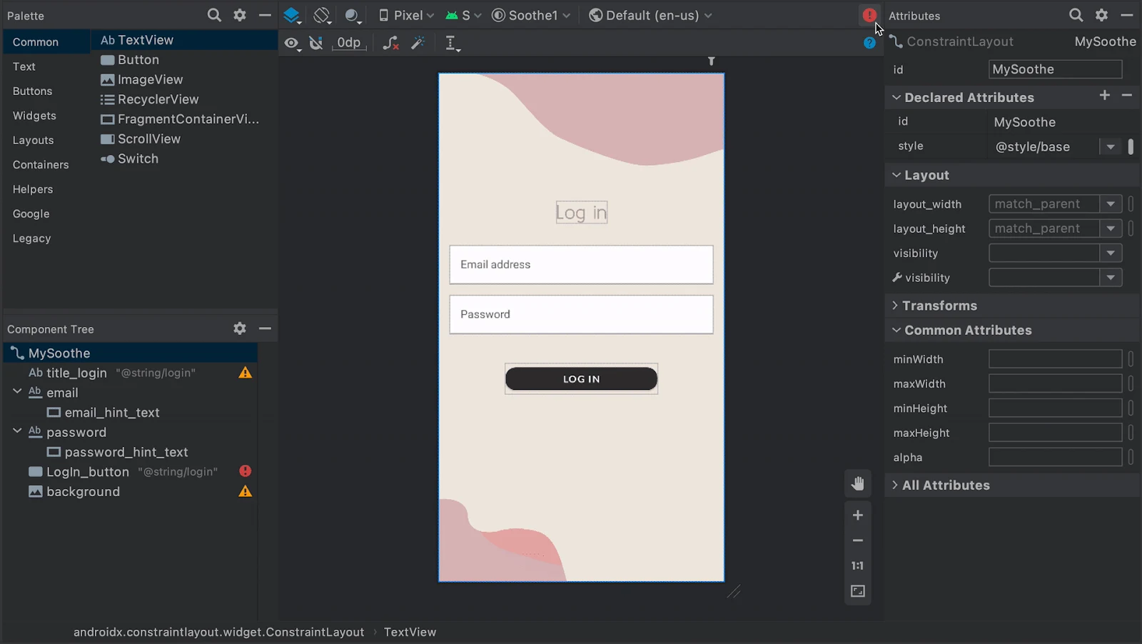
Accessibility Insights for Android is an open-source tool that helps Android developers find and fix accessibility issues by providing automated testing checks and manual testing guidance.
(Source)
Cross-platform
Axe: This tool is a browser extension and API for automated accessibility testing that developers can use for iOS and Android.
Lighthouse: Available in Chrome DevTools, this tool can help developers assess web apps that run on mobile devices.
Sauce Labs: With Sauce Labs mobile accessibility testing tools, developers can upload their apps, configure test options to suit their needs, run Appium tests for both Android and iOS and use Sauce Insights to get a big-picture view of their test histories and failure patterns.
Running Your First Accessibility Test on Sauce Labs
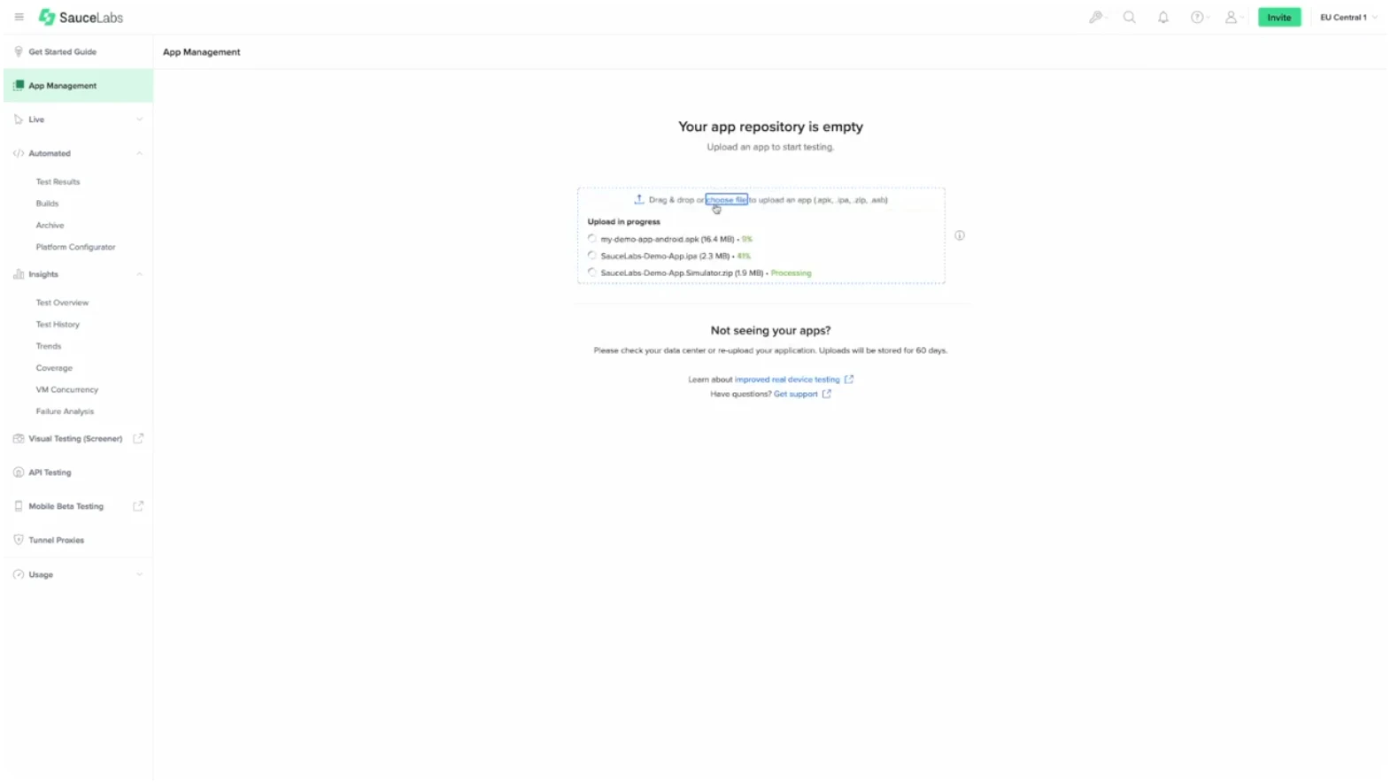
To run mobile accessibility tests using Sauce Labs, you'll first need to upload your app to your app repository.
Once your app is successfully uploaded, you can view and manage it among numerous other apps.
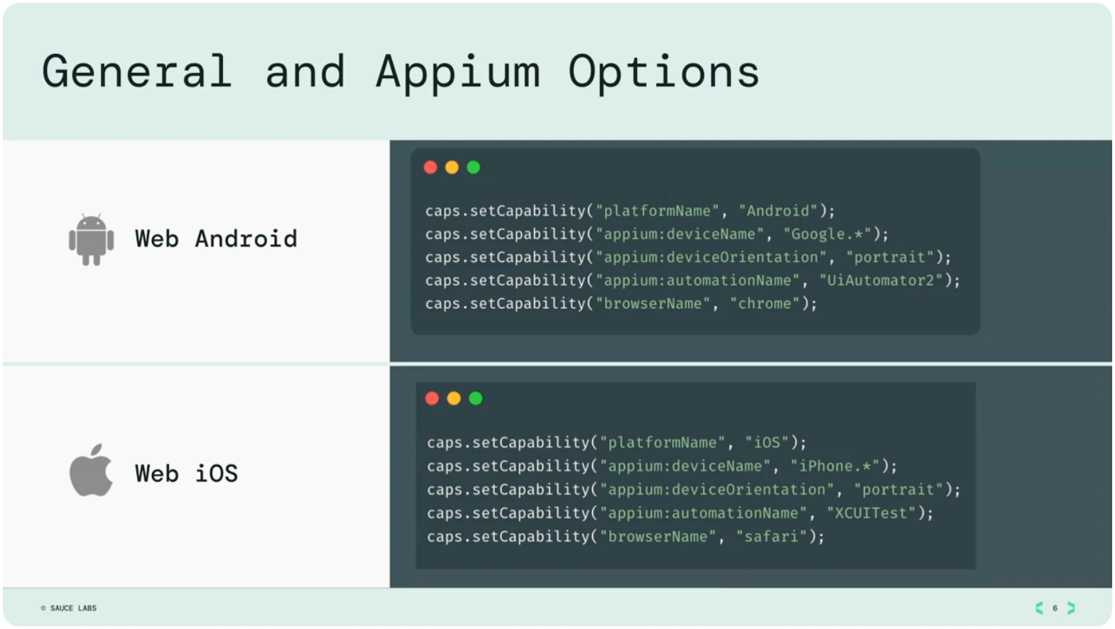
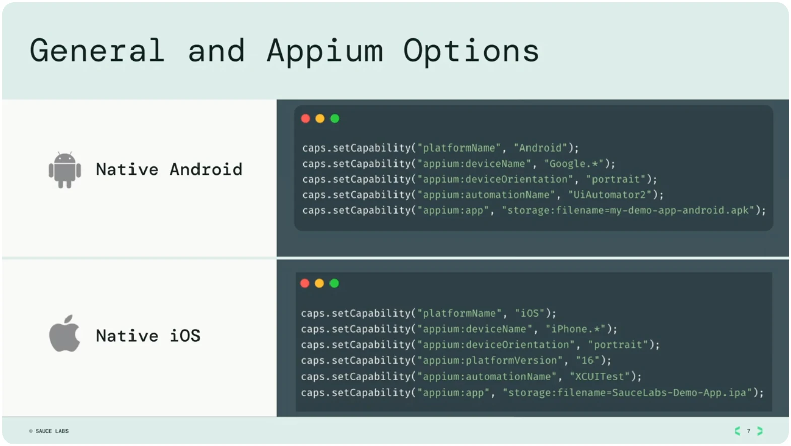
Once your app is loaded, you can go into your test code to configure how you'll communicate information between your app and Sauce Labs. These options are combined with general and Appium options for mobile testing.
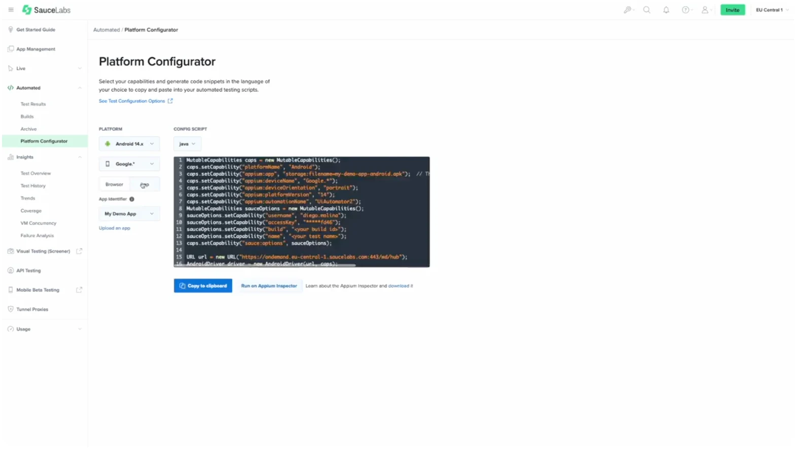
4. Sauce Labs also provides a Platform Configurator, which makes it easy to see all the available options for all the available apps and devices. Here, you can pick the desired platform and whether you’re using a simulator, emulator, real mobile device, or native app.
5. Once your options are configured, you can start your tests and watch them run live.
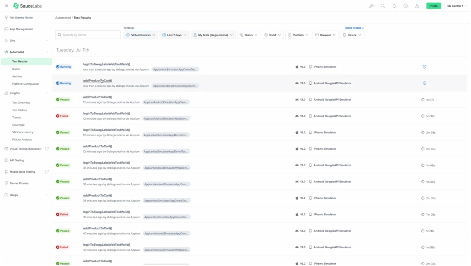
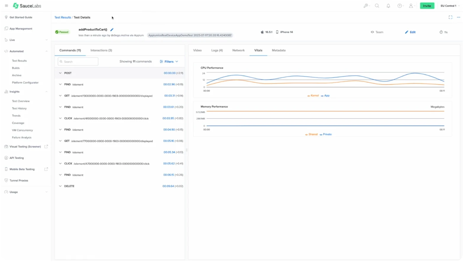
6. After you’ve run your tests, you can use Sauce Labs to see all the run commands.
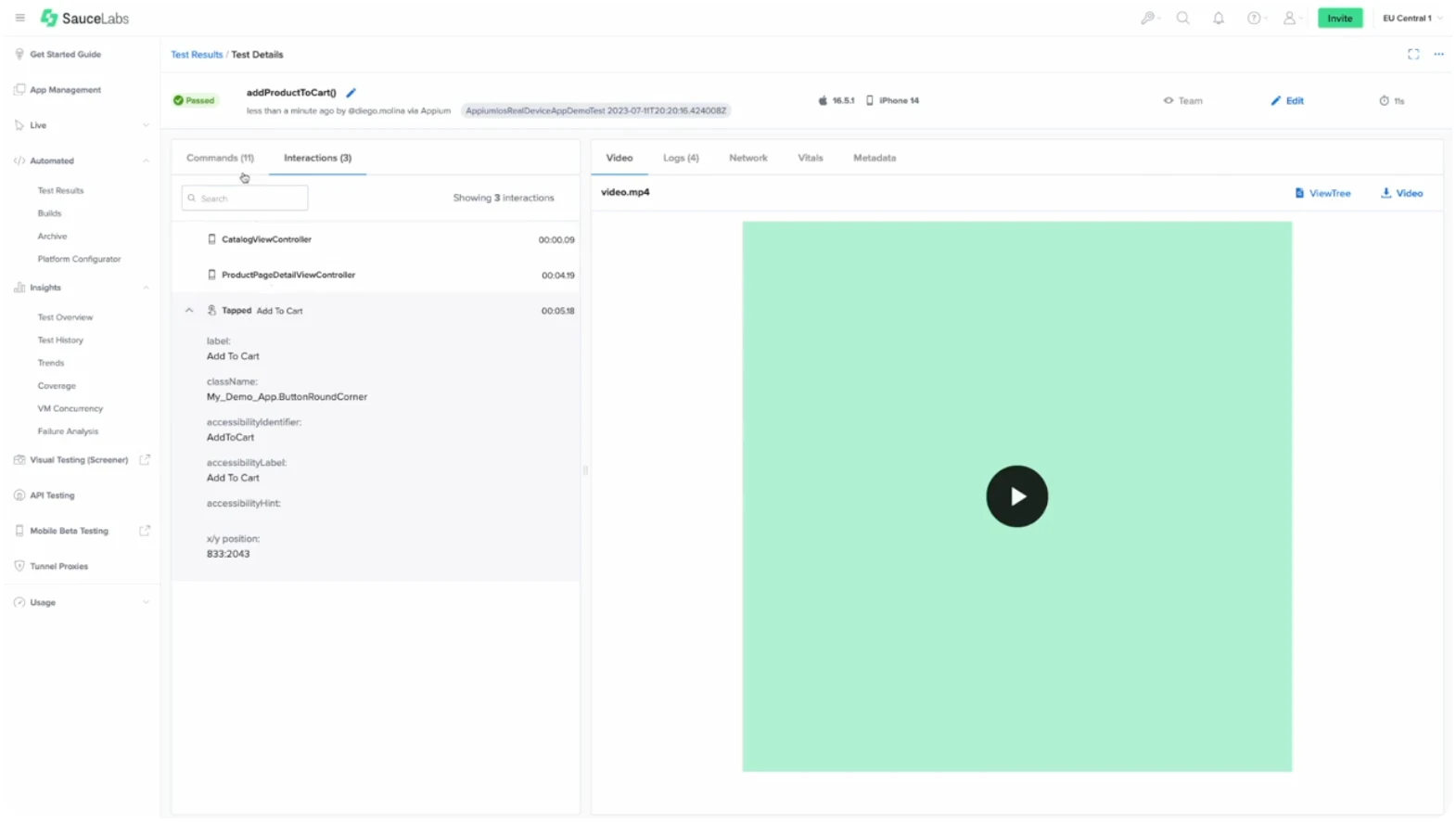
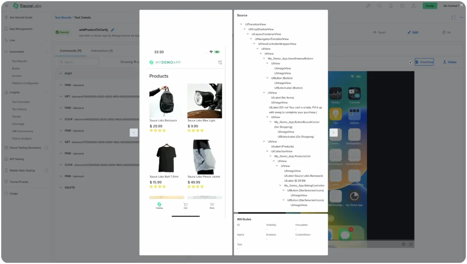
Similarly, you can use Sauce Labs to see all the tested elements.
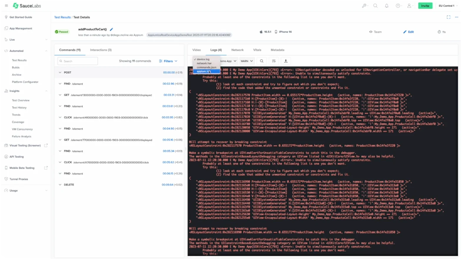
You can view logs for all the tests you've run to get a more granular view of your tests and their results (as well as debugging any failed tests).
You can also check application vitals to see how much CPU and memory the app uses.
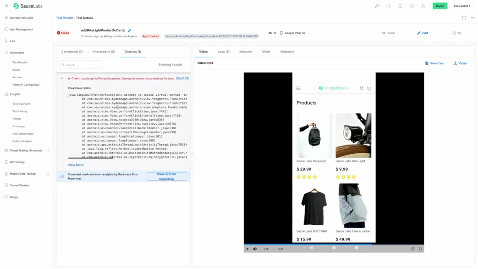
If your app crashes, Sauce Labs provides crash analytics to help you understand why it crashed and how you can fix it.
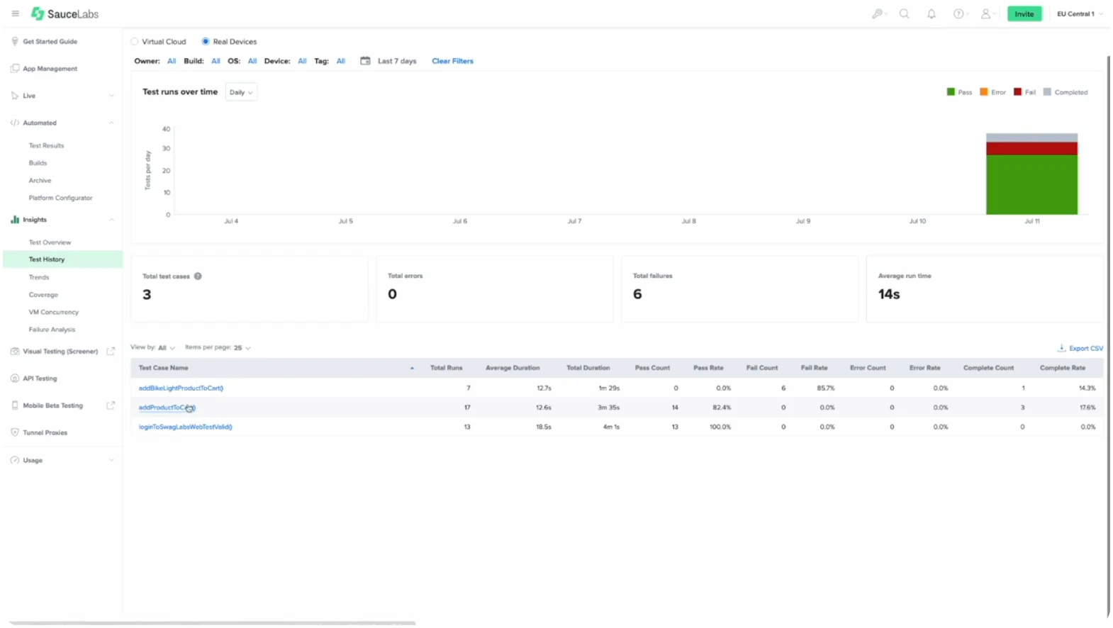
As you run tests over time, you can use test Insights as a way to see the history of a test and discover if there are any patterns across failed tests.
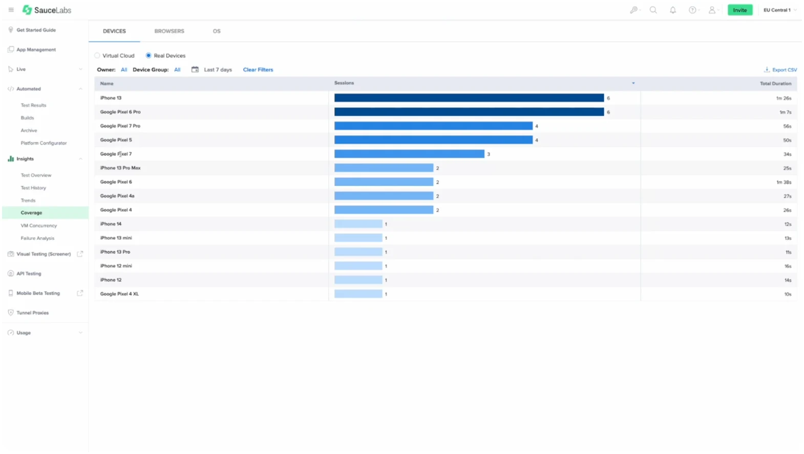
In the same hub, you can also check on test coverage to ensure the test suite you’re building tests everything you need it to.
To see these steps in action, check out our mobile accessibility demo.
Making Accessibility Accessible
Making mobile apps accessible is a priority for various reasons, ranging from connecting with more users for growth to connecting with more users for inclusivity.
But the nature of disability—a diverse category with a variety of issues and needs—means that accessibility often doesn’t feel accessible to developers without the right tools. Even developers who care deeply about accessibility can struggle to catch every issue independently.
However, with an automated testing tool like Sauce Labs, developers can trust that their efforts will be supported by a tool that can scale far beyond their manual efforts. To try accessibility testing on Sauce Labs, request a demo or read more about our approach to accessibility.
Jump to content
What Is Mobile App Accessibility Testing?
Why Is Mobile Accessibility Important?
Complying with the ADA, WCAG, and the EAA
Mobile App Accessibility Checklist
Manual vs. Automated Accessibility Testing
Mobile App Accessibility Testing Tools
Running Your First Accessibility Test on Sauce Labs
Making Accessibility Accessible


